
Thursday, September 30, 2010

Thursday, September 23, 2010
splat

Tuesday, September 21, 2010

Tuesday, September 14, 2010
Monster

my monster has a little bit of symmetrical balance with the shoulders and feet its is a little out of proportion because of the upper legs are so big and the eyes are a little big, there is no rythiem its just sort of random i gusse the emphasis point would be the face.. i think it has ok unity there are some principles represinted .
Friday, September 10, 2010

Thursday, September 2, 2010
 |
| this picture uses parallel lines and color to make the likes apear horizontal but in reality they are still just parallel lines This picture has symmetrical balance, it dosent really contain any kind of propourtion but has a linear rythem. the emphasis points i think would be the horizontal lines between the squares. it has some kind of unity. DIRECTION  This picture dosent really have a define balance, it is in somewhat proportion because it has prospective and a vanishing point but the joker still looks larger then the biuldings, it also has a little gradation rythem and maybe a little alternation in the biuldings. the emphasis point is defenitly the joker and has a pretty good unity. SHAPE  this Picture uses alot of round shapes like peace and well roundness. This picture has a asmetrical balance and there is no real proportion but has a nice alternation rythem in the circular parts and with the leafs. the emphasis point is deffenetly the circlesand it has nice unity with the warm colors and the circular lines showing peace and well being. TEXTURE  this picture has a rought looking texture this is a picture of crumbled up paper This picture dosent really have to much principles of design, it dosent really have any balance or proportion. the rythem is just kinda random and i gusse the emphisis point could be the wrinkles i dont think this pic really has unity because it dosent really show to many principles. SIZE 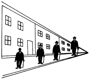 this picture shws 4 guys that all look diffrent sizes but its reall just the lines in the back getting smaller that make the little guys look diffrent sizes they are actally all the same. This picture has symmetical balnce with the little men and maybe asymmetrical balance in the biulding, the proportion is actaly in proportion even if it looks like its not. the little men have repition rythem but the biulding in the back has more of a alternation rythem. the emphasis point i think is both the men and the biulding because it wants you to look at both of them and it also has good unity becasue it shows alot of the princibles working together.  this picture shows lots of color. This picture is compleatly random it has no balance i dont think and it has no proportion because its not comparing anything there isnt really a rythem because there are just words all jumbled together. the emphasis i gusse would be on the brighter colors and it dosent really have that good unity because not to many principles were used.  this picture shows Value/ tone of happyness cause there singing and the picture shows alot of vertical lines and diagnal lines This picture has kinda a asemmetrical balance with the women in the front singing, she is a little out of proportion because of the man in the bottem right hand corrner is so small. the rythem could be repition because it has repeting lines. The emphasis point is defenitly the women singing and it has good unity with all the priciples |
Subscribe to:
Posts (Atom)